5分钟阅读
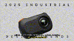
2025设计趋势炸裂剧透!工业设计圈新顶流来袭(原始内容)
Welcome back! It’s 2025 and we’re not dead yet, so that means it’s time for the latest industrial design trends.

Today I’m going to be looking at some trends for industrial and physical product design,
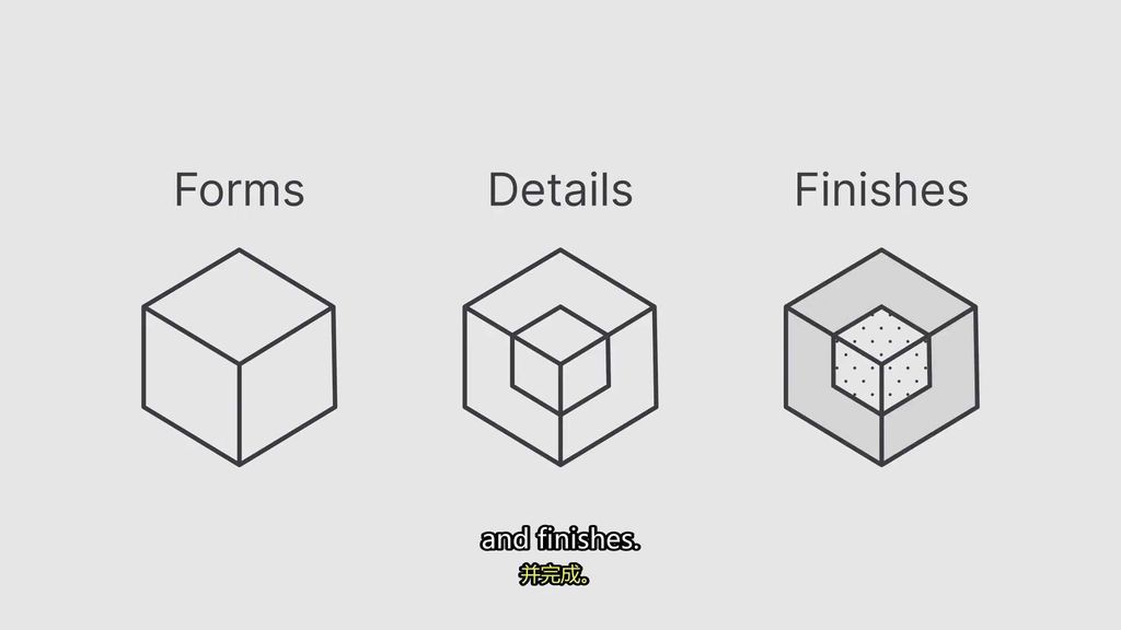
And I’ll be showing you what’s cool in form, details, and finishes.
Which I guess you only like if you’re a product designer, but maybe you’re a weirdo like me and you like this stuff.
Anywho, as always on Some Great Things, we’ll be designing some products along the way,
And since I can’t get my video equipment ever working, we’re going to do some cameras.
So without further delay, let’s get into the industrial design trends for 2025. Let’s go.
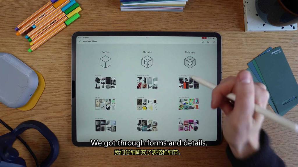
So as always on Some Great Things, we will be looking at forms, details, and finishes.
So starting off with our first form trend,
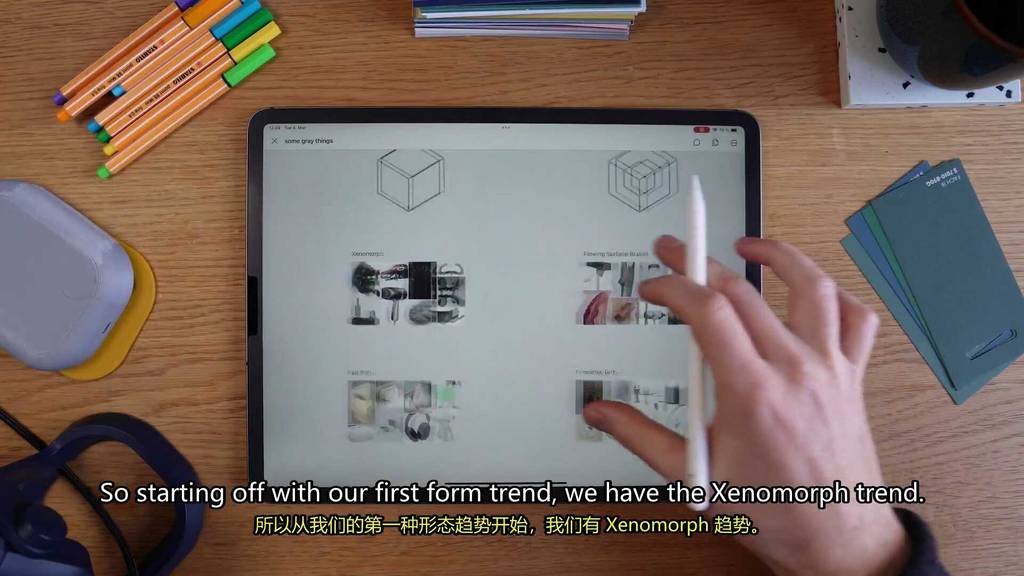
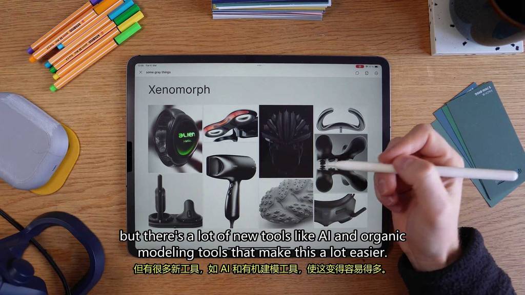
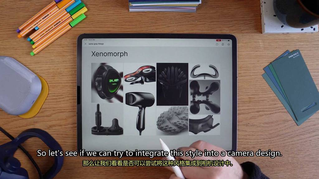
We have the Xenomorph trend.
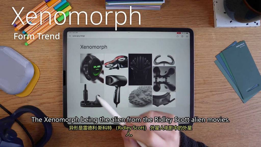
Xenomorph being the alien from the Ridley Scott alien movies.

This form’s all about smooth, fluid, organic shapes that look like they’re from space.
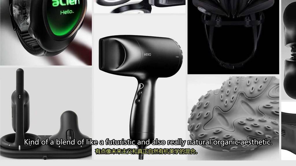
Kind of a blend of like a futuristic and also really natural organic aesthetic.
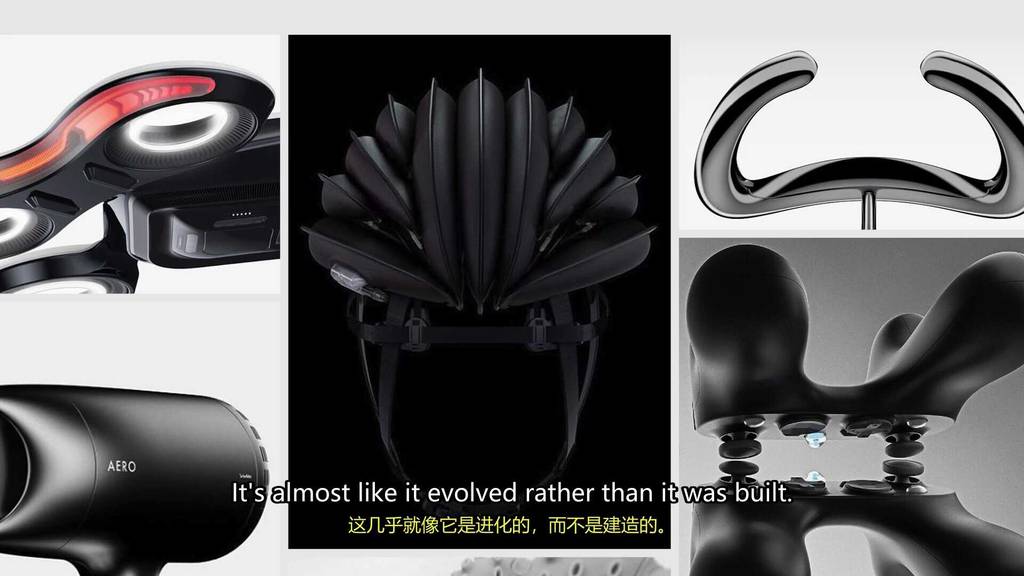
It’s almost like it evolved rather than it was built.
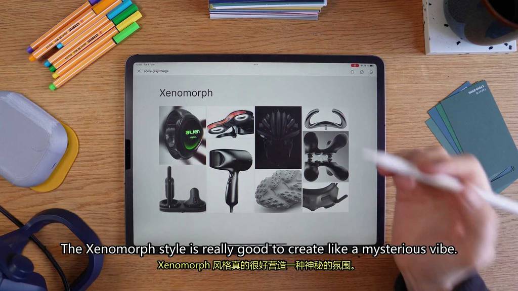
The Xenomorph style is really good to create like a mysterious vibe.

It’s also really functional.
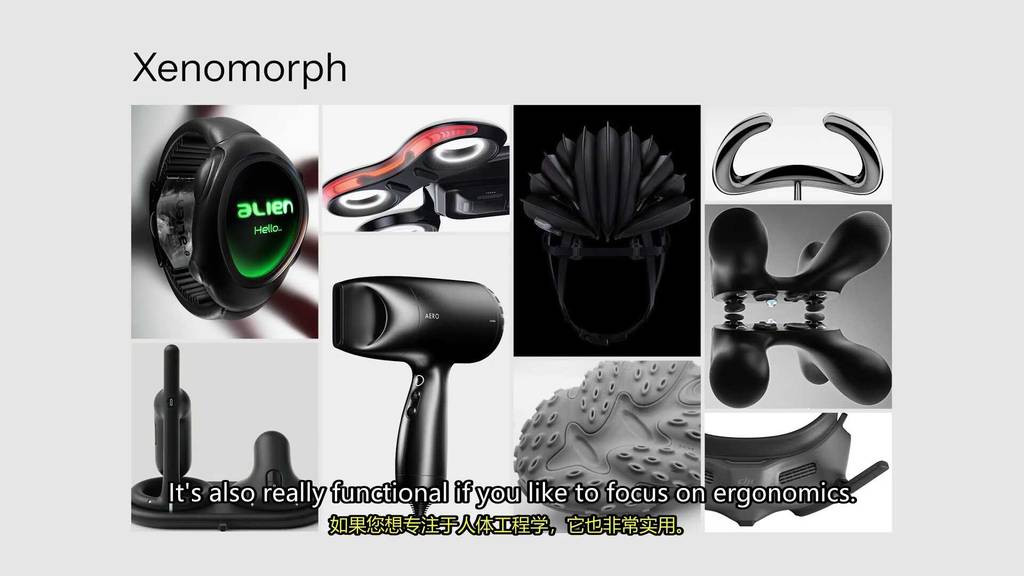
If you like to focus on ergonomics,
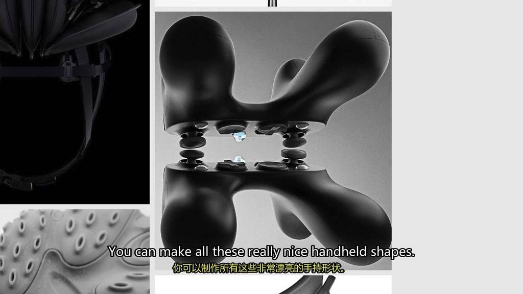
You can use it to create these nice handheld shapes.
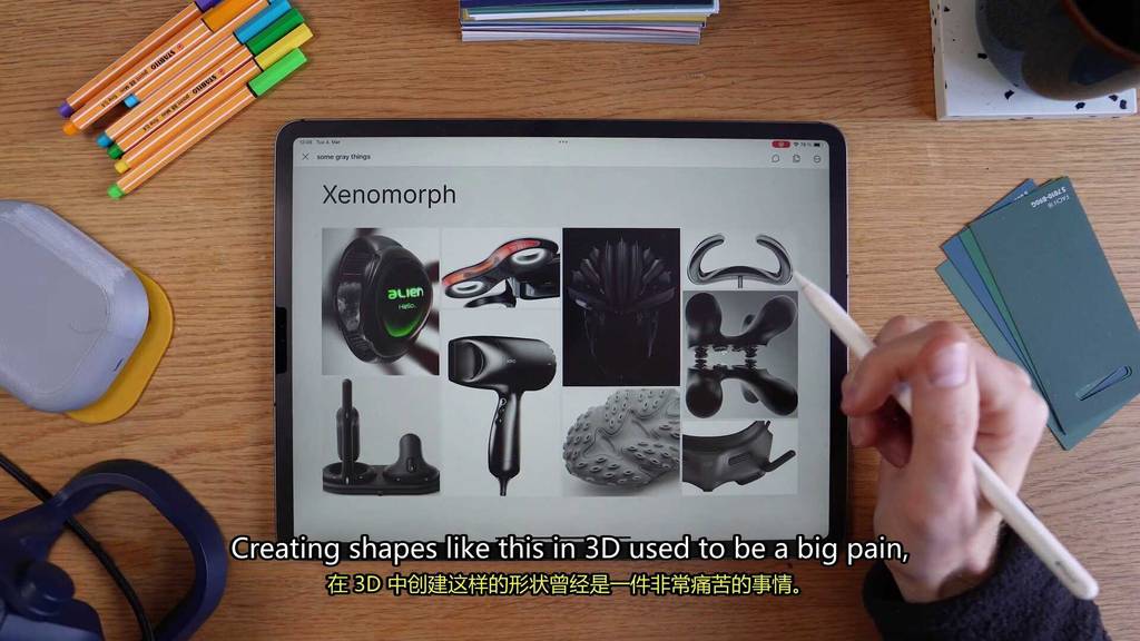
Creating shapes like this in 3 D used to be a big pain,
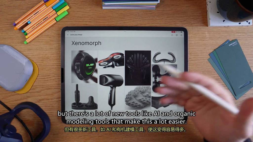
But there’s a lot of new tools like AI and organic modeling tools that make this a lot easier.
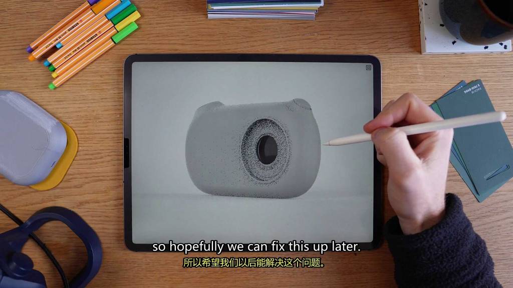
So let’s see if we can try to integrate this style into a camera design.
So here we kind of have like our blobby camera shape where the buttons kind of flow into the body.
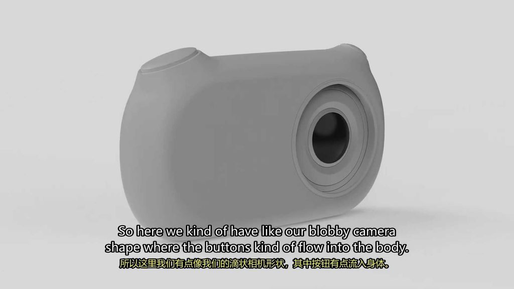
Right now it just kind of looks like a big blob, so hopefully we can fix this up later.
Let’s go.
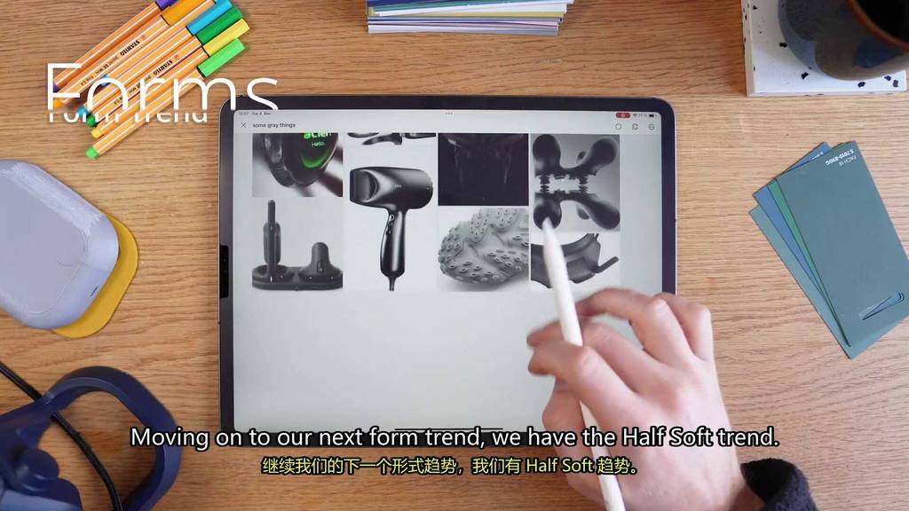
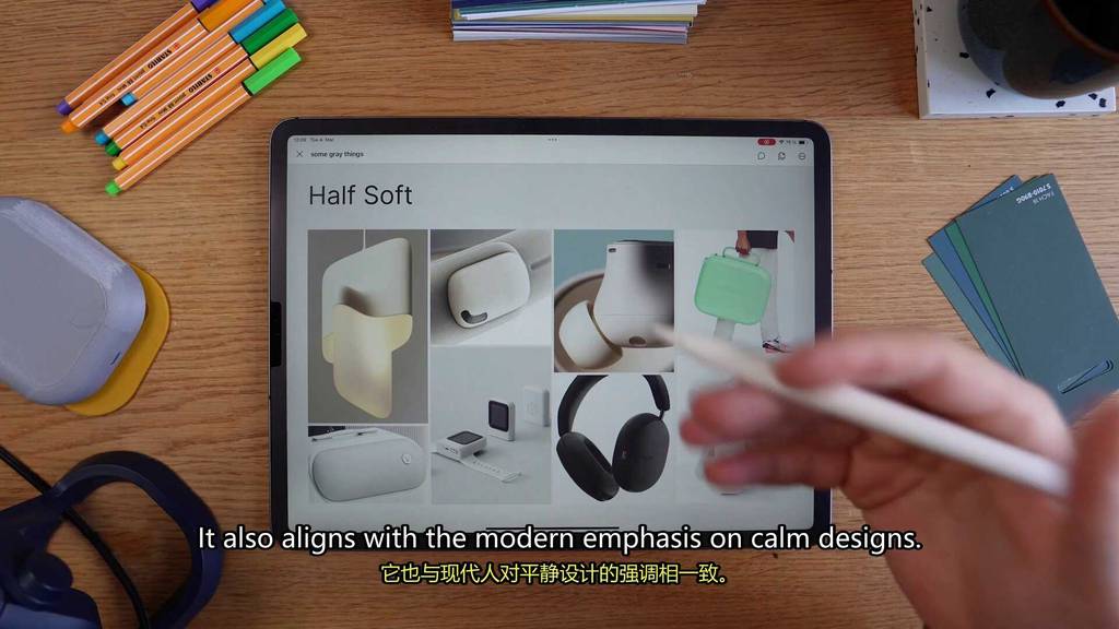
Moving on to our next form trend, we have the half soft trend.
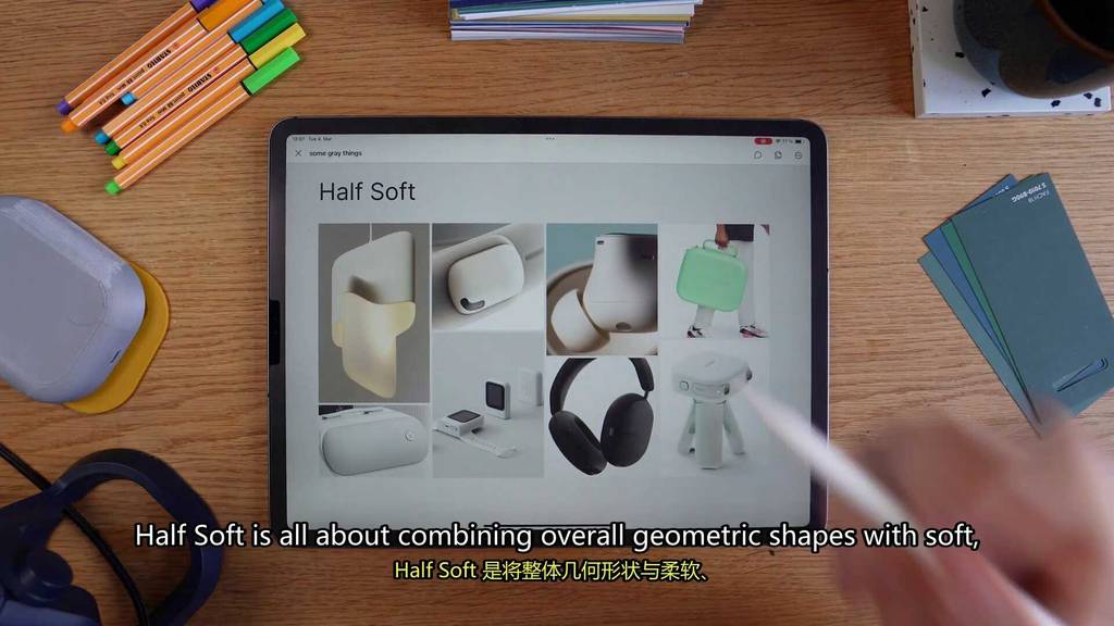
Half soft is all about combining overall geometric shapes with soft, rounded surfaces.
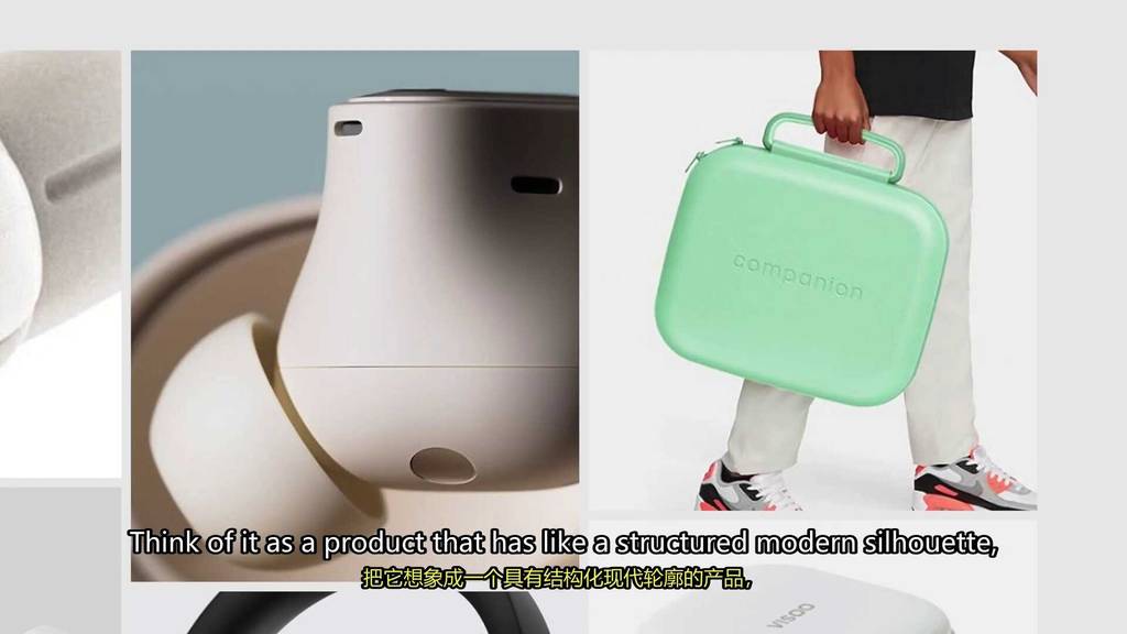
Think of it as a product that has like a structured modern silhouette,
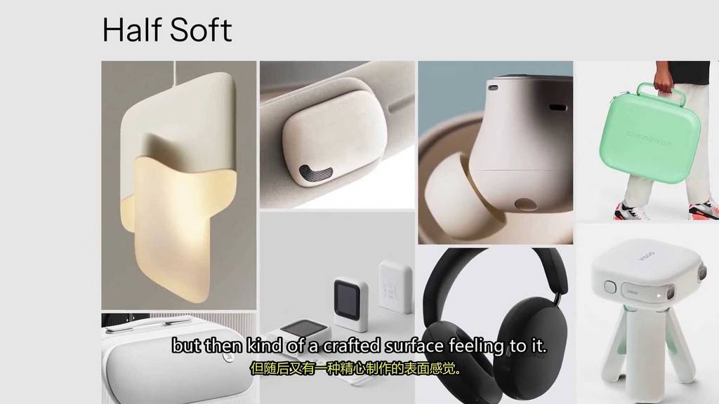
But then kind of a crafted surface feeling to it.
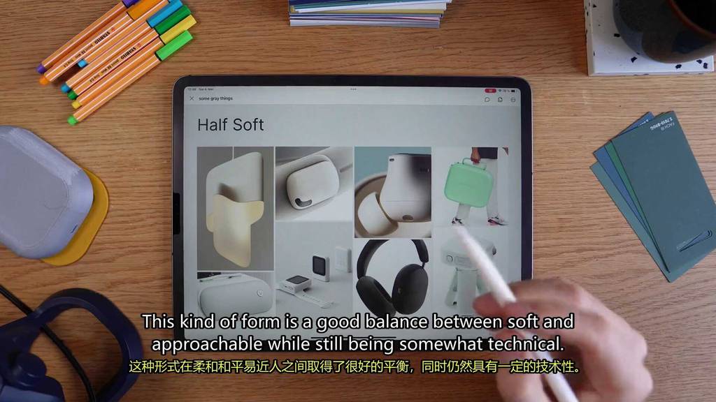
This kind of form is a good balance between soft and approachable while still being somewhat technical.
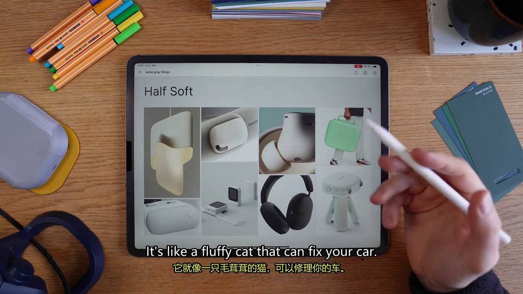
It’s like a fluffy cat that could fix your car.
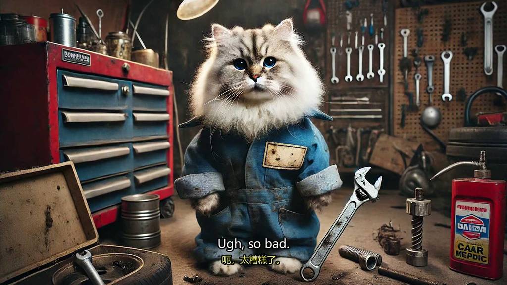
Ah, so bad.
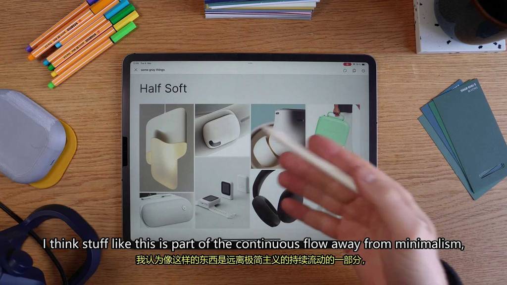
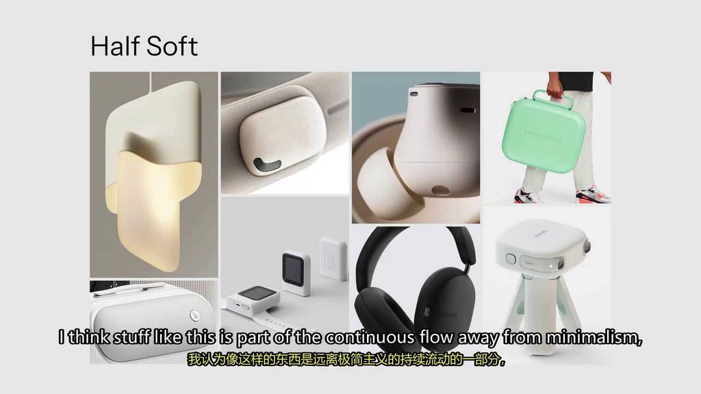
I think stuff like this is part of the continuous flow away from minimalist,

I think stuff like this is part of the continuous flow away from minimalist,
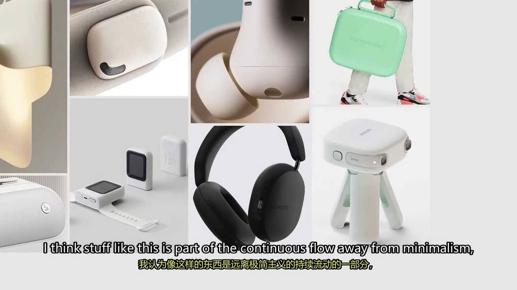
I think stuff like this is part of the continuous flow away from minimalist,
Where you see industrial design still being minimal, but it’s slowly moving away from that.
It also aligns with the modern emphasis on calm designs.
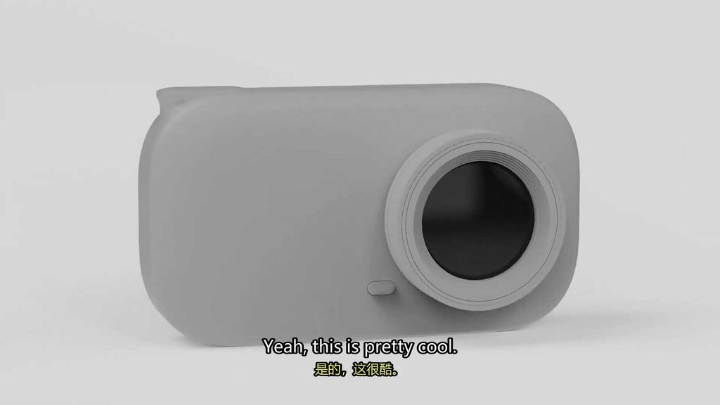
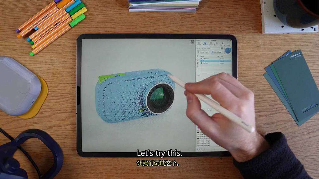
So why don’t we try to use this to design one of our cameras and see what happens.
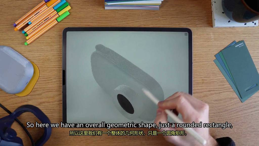
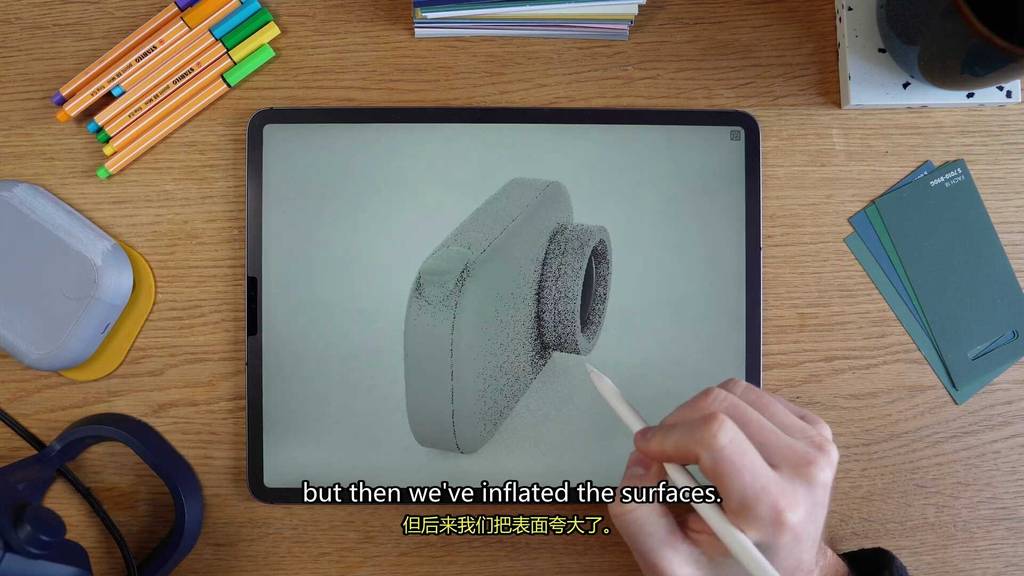
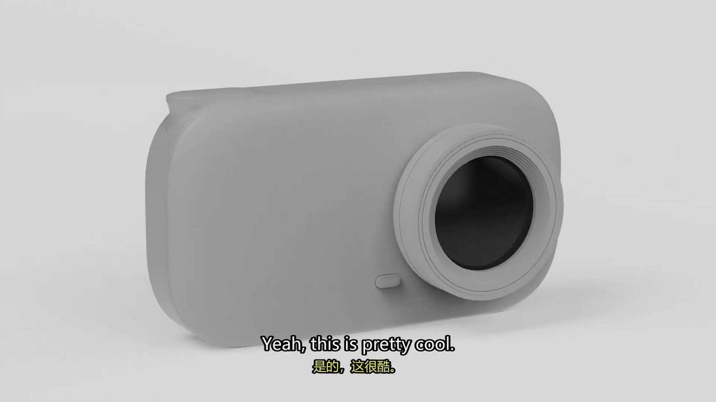
So here we have an overall geometric shape, just a rounded rectangle, but then we’ve inflated the surfaces.
This is like pretty much my style. Geometric shapes, soft surfaces.

Yeah, this is pretty cool.
Moving on to the next form.
While the last one was a little bit soft, this one is tough.
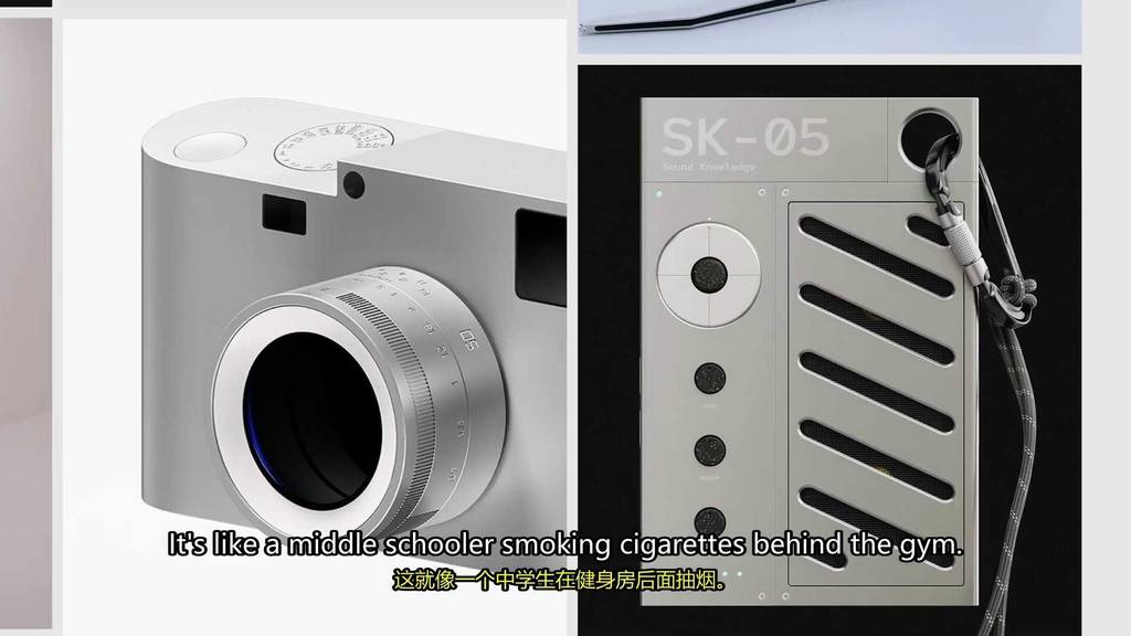
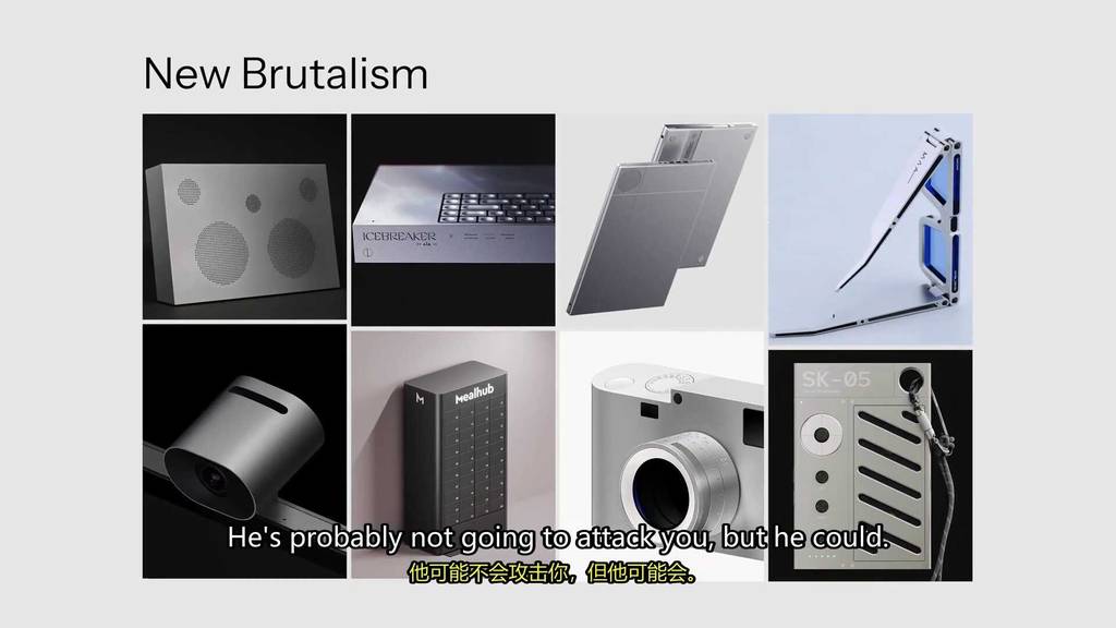
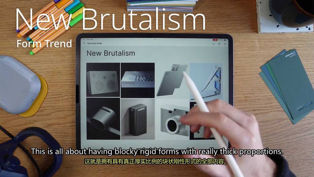
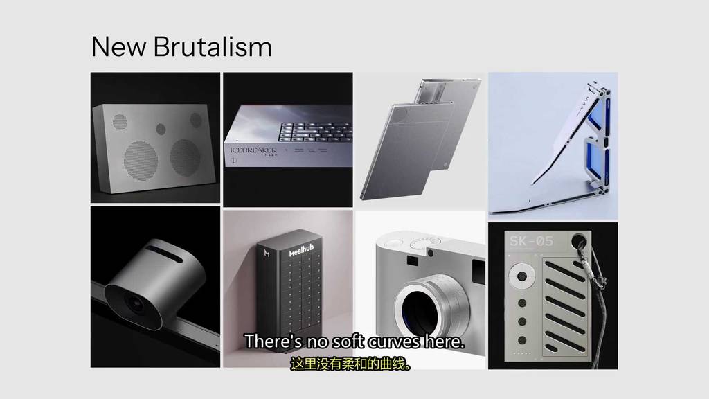
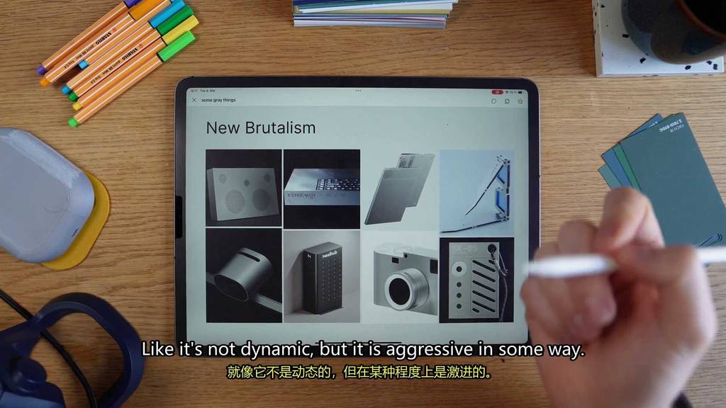
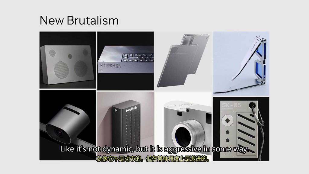
This one’s called New Brutalism.
This is all about having blocky rigid forms with really thick proportions.
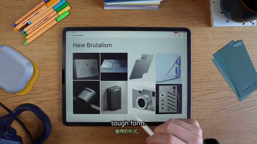
There’s no soft curves here. It’s just kind of raw, functional design.
It’s like a lot of hard-looking boxes.
It gives your product a really tough, reliable look.
Like these products would really last for decades.
There’s also something kind of cool about it.
Like it’s not dynamic, but it is aggressive in some way.
It’s like a middle schooler smoking cigarettes behind the gym.
He’s probably not going to attack you, but he could.
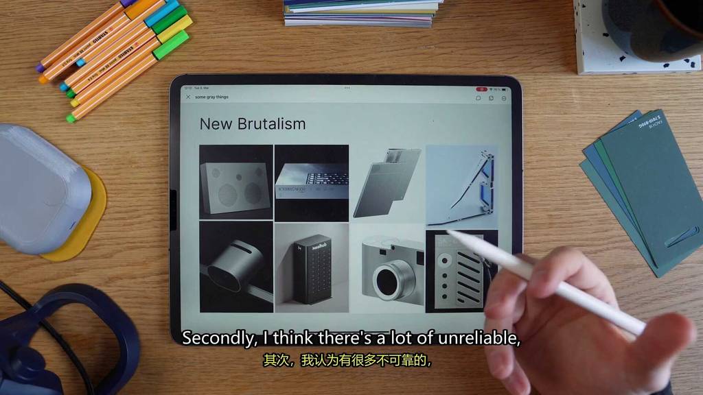
A lot of design recently is pretty soft and friendly, so it kind of makes sense to do something different, which is like hard and a little bit standoffish.
Secondly, I think there’s a lot of unreliable, really breakable products out there.
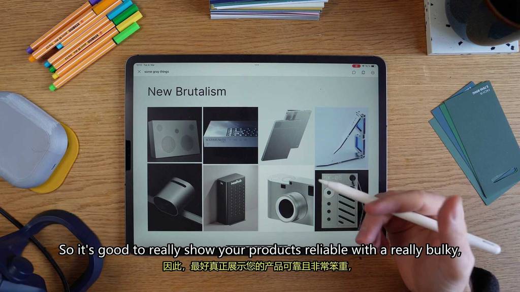
So it’s good to really show your products reliable with like a really bulky, tough form.
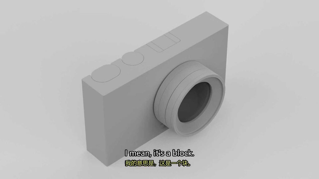
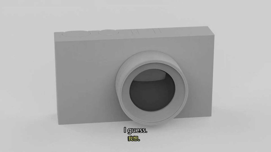
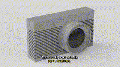
Let’s see if we can use this idea to make a camera.
I mean, it’s a block.
I think it needs some materials and finish on it, but it’s a good start, I guess.
So now that we’ve done our form trends, let’s move on to our detail trends.
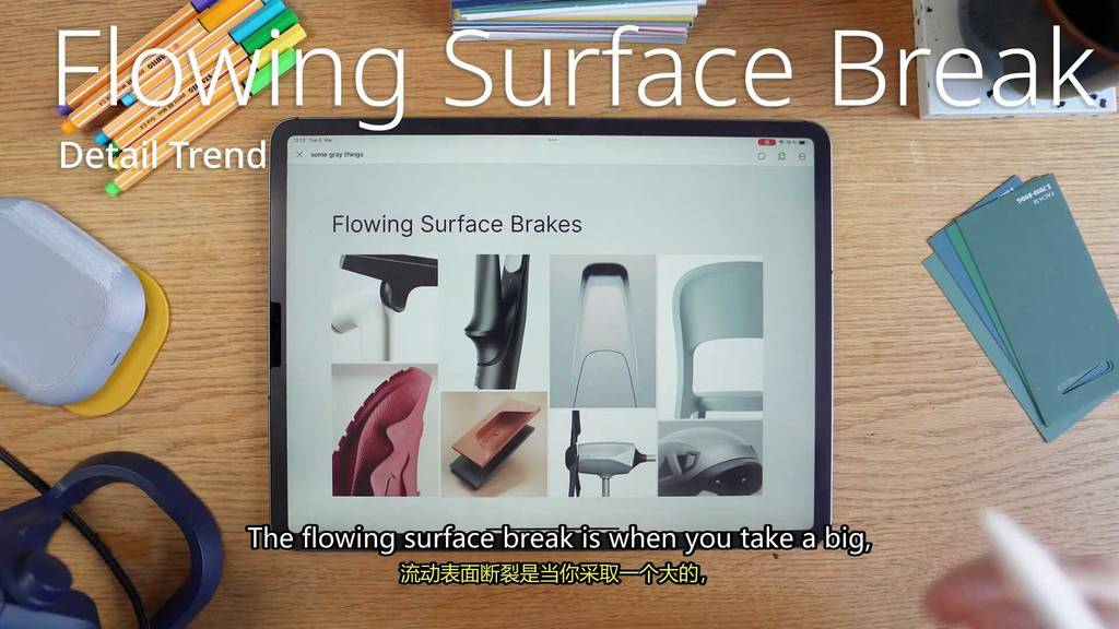
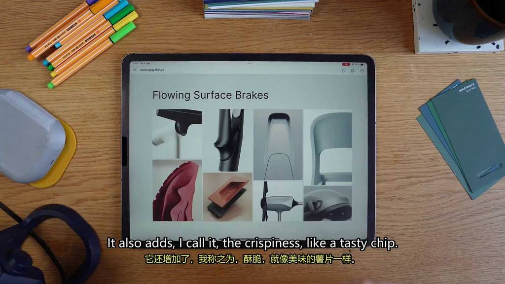
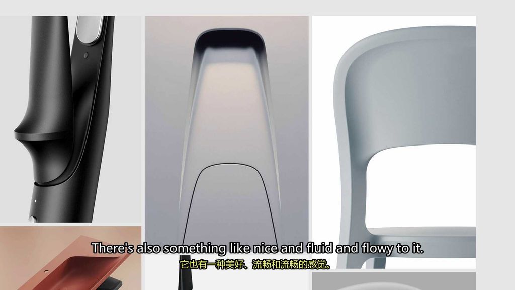
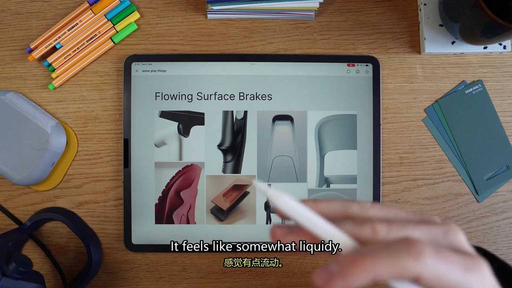
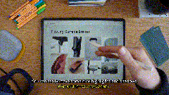
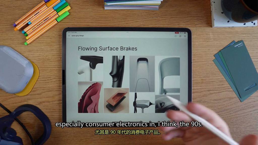
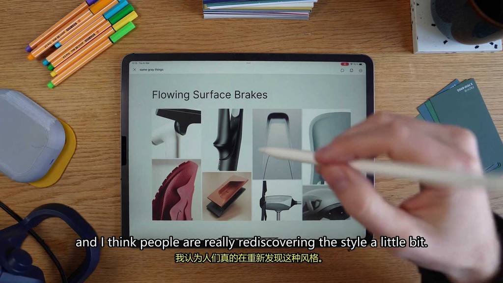
The first detail trend is the flowing surface break.
The flowing surface break is when you take a big boring surface and add some creases into it to give it a little bit of flow.
You see this kind of thing a lot in car design, but now you see its way making the other areas of product design.
It’s a great way to break up plane surfaces while adding a little bit of dynamics to it.
It also adds, I call it the crispiness, like a tasty chip.
There’s also something like nice and fluid and flowy to it.
It feels like somewhat liquidy.
You can really make some nice highlights and shadows.
You used to see this a lot more in lots of products, especially consumer electronics in like, I think the 90 s.
But now it’s really coming back.
I think people are really rediscovering the style a little bit.
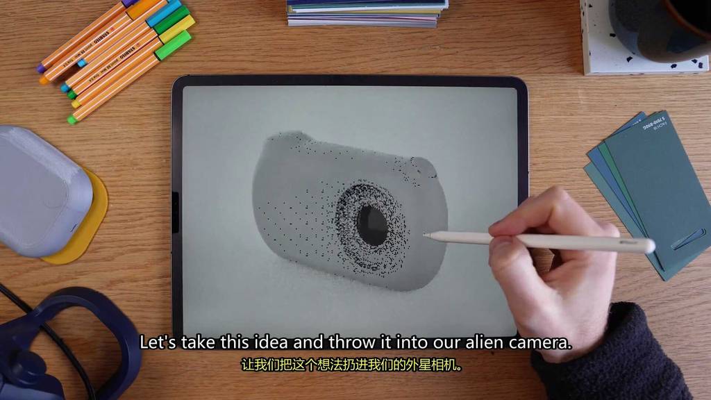
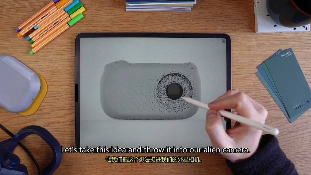
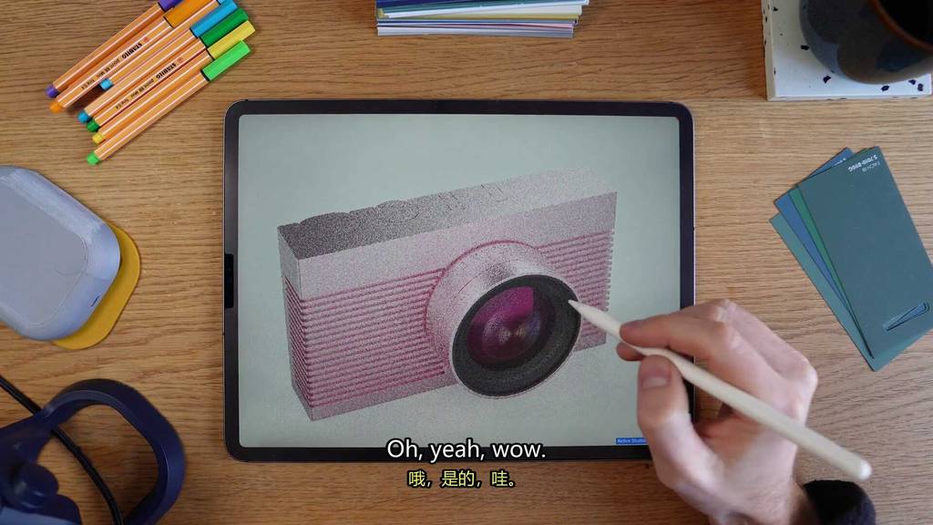
Let’s take this idea and throw it into our alien camera.
Oh yeah, I think that’s exactly what we needed.
Before it was just kind of a big blob thing and now it’s got a bit more structure to it.
We went from having some mashed potatoes to some crispy fries.
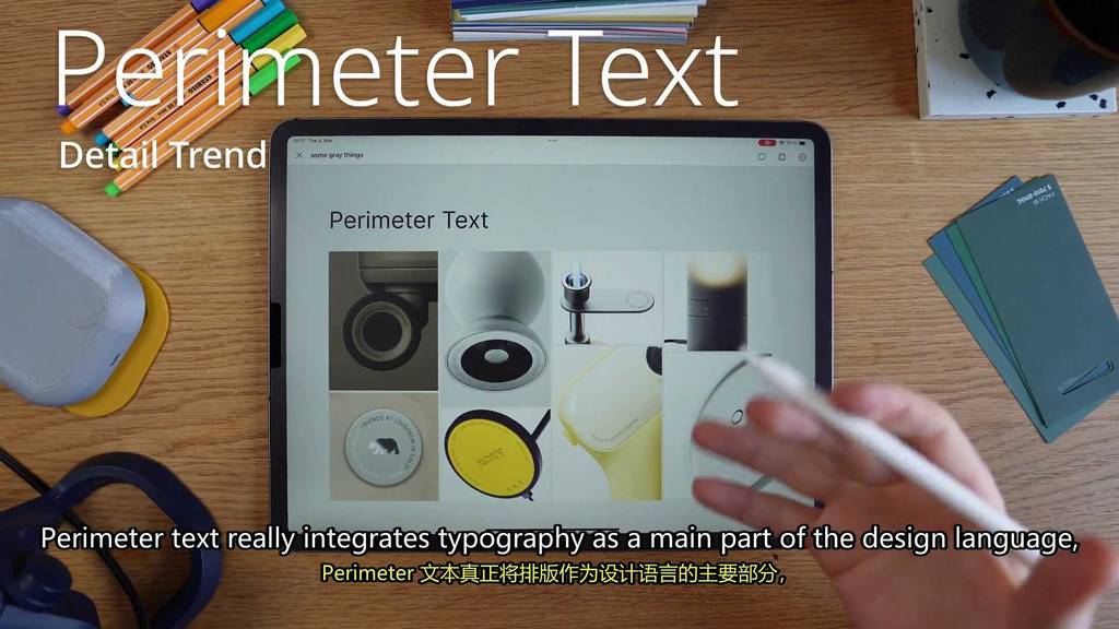
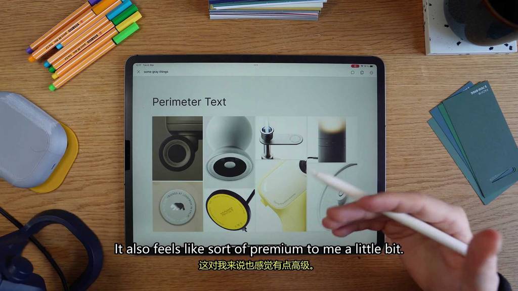
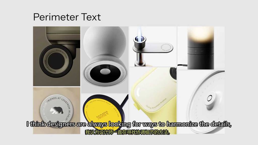
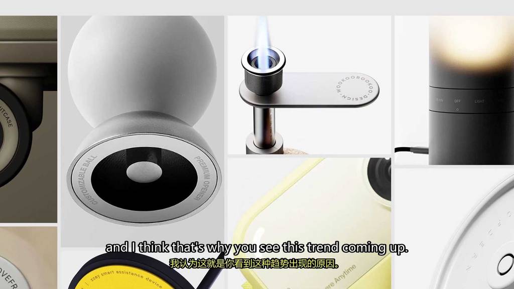
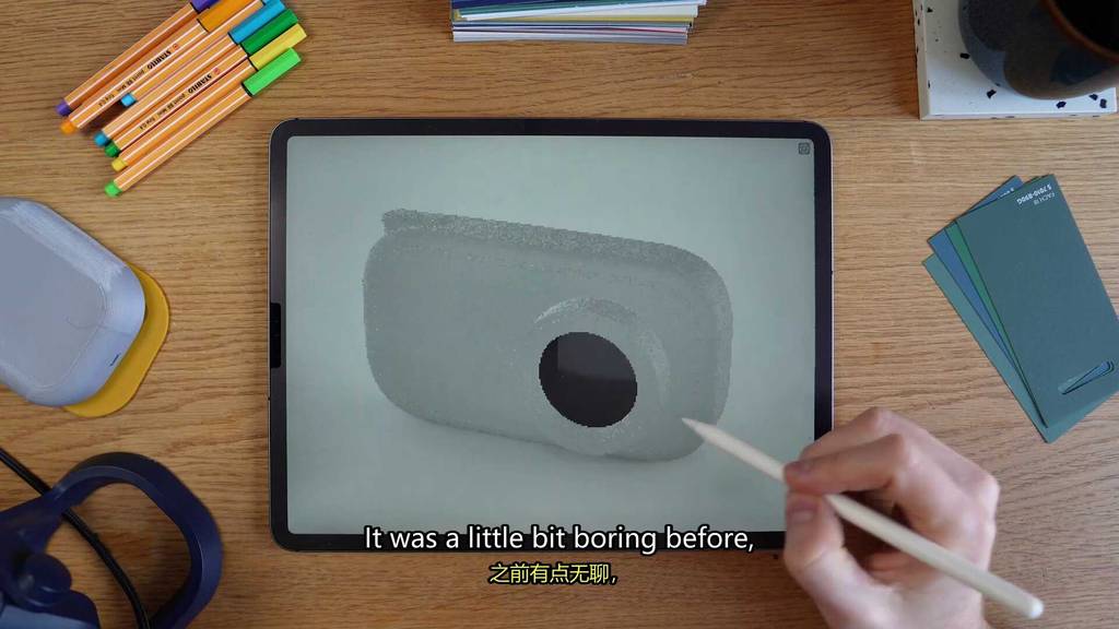
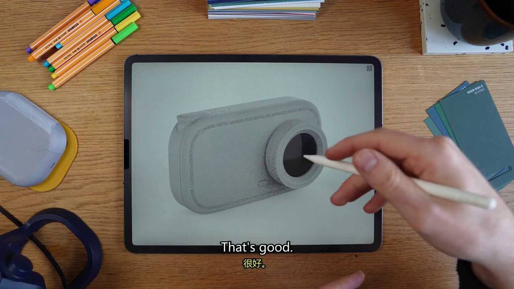
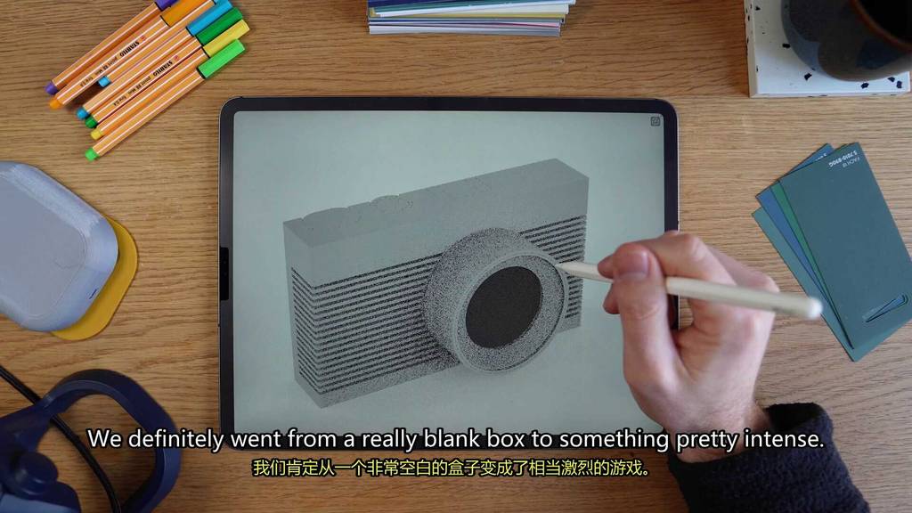
Moving on to our next detail trend, I like to call the perimeter text.
Perimeter text really integrates typography as a main part of the design language.
So it’s not just an afterthought anymore.
You basically place text along the contours of a design to kind of accentuate the form but also add a little bit of a graphic element.

It adds some nice complexity without making things visually messy.
It also feels like sort of premium to me a little bit.
Gucci Gucci, Louie Louie, look it up.
I think designers are always looking for ways to harmonize the details and I think that’s why you see this trend coming up.
People really taking the text that they need to have on a product anyway.
And really using it as a main design element.
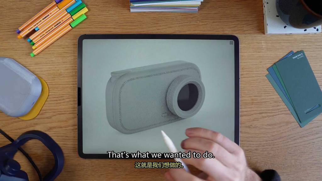
So why don’t we try to integrate a little typography.
See how it looks on the half soft camera.
Beep boop beep.
Oh yeah, cool.
I think that really did it.
It was a little bit boring before and I think this just kind of added an integrated design element that looks clean.
That’s good.

That’s what we wanted.

That’s what we wanted.
Okay.
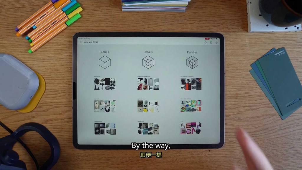
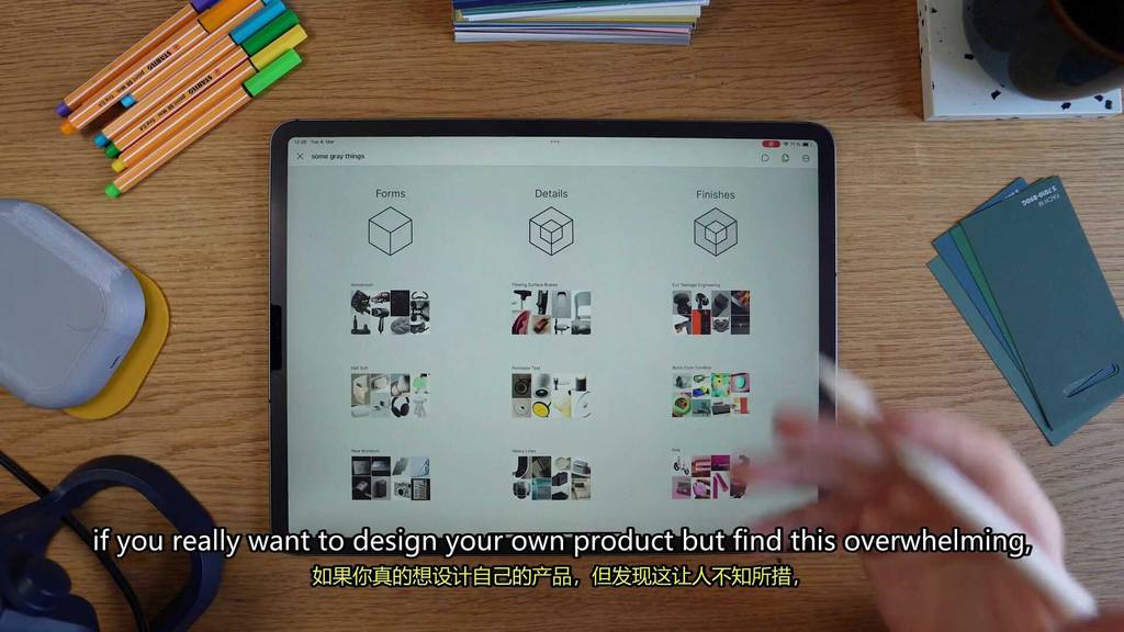
By the way, if you really want to design your own product but find this overwhelming.
Feel free to get in touch with me.
Somegreatthings. Com
Work with me.
I’m cool.
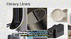
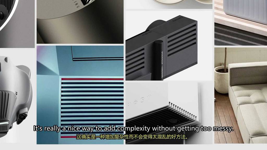
Moving on to our final detail trend is the heavy line texture.
This trend is all about deep bold lines.
Instead of just being decorative, these textures really serve a functional role.
So sometimes they’re cut out for air vents or sometimes they’re stiffening of the surface.
It’s like a heavy functional detail.
I think these lines give products a lot of technical precision.
They’re heavy and structured and make things look very mechanical.
It’s really a nice way to add complexity without getting too messy.
I think this is part of something I’ve seen in industrial design where designers are really trying to highlight functions instead of just hide them.
Chunky things have slowly been coming up in industrial design too.
For instance, last year we had the big circles trend.
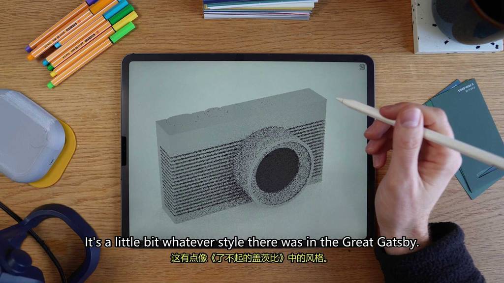
So let’s see if we can bring this into our brutalist camera and add some lines.
Oh yeah.
Okay.
That was really loud actually.
We definitely went from like a really blank box to something pretty intense.
It’s a little bit whatever style there was in the Great Gatsby.
We got through forms and details.
Let’s get to the last three trends which are the finish trend.
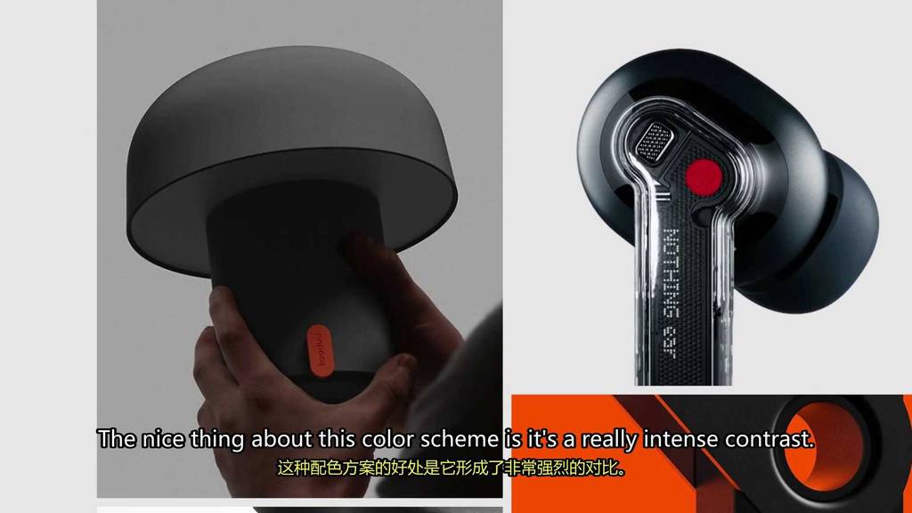
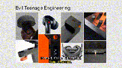
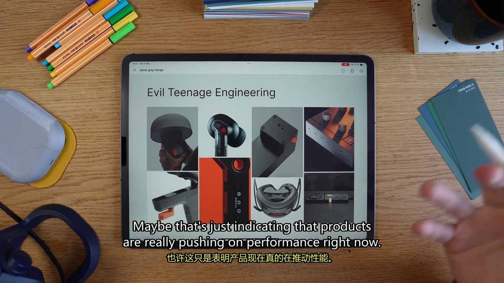
The first finish trend, evil teenage engineering.
Dark color base, typically black or gray with a pop in orange highlight.
Evil teenage engineering I think is an evolution of the orange and light gray trend that really got popular a lot.
Really got popularized by teenage engineering.
The nice thing about this color scheme is it’s a really intense contrast.
It’s bold.
It’s like high energy and it really gives a product an aggressive feel.
It’s also pretty functional.
Like you can really direct somebody’s attention to important details like buttons or interactions.
This kind of color combo is also pretty common in performance gear.
But now I think you see it coming to a bigger range of products.
Maybe that’s just indicating that products are really pushing on performance right now.
Nobody wants boring colors anymore.
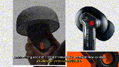
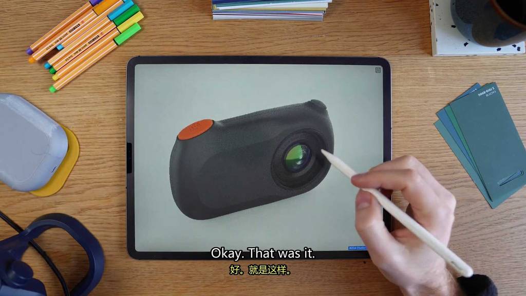
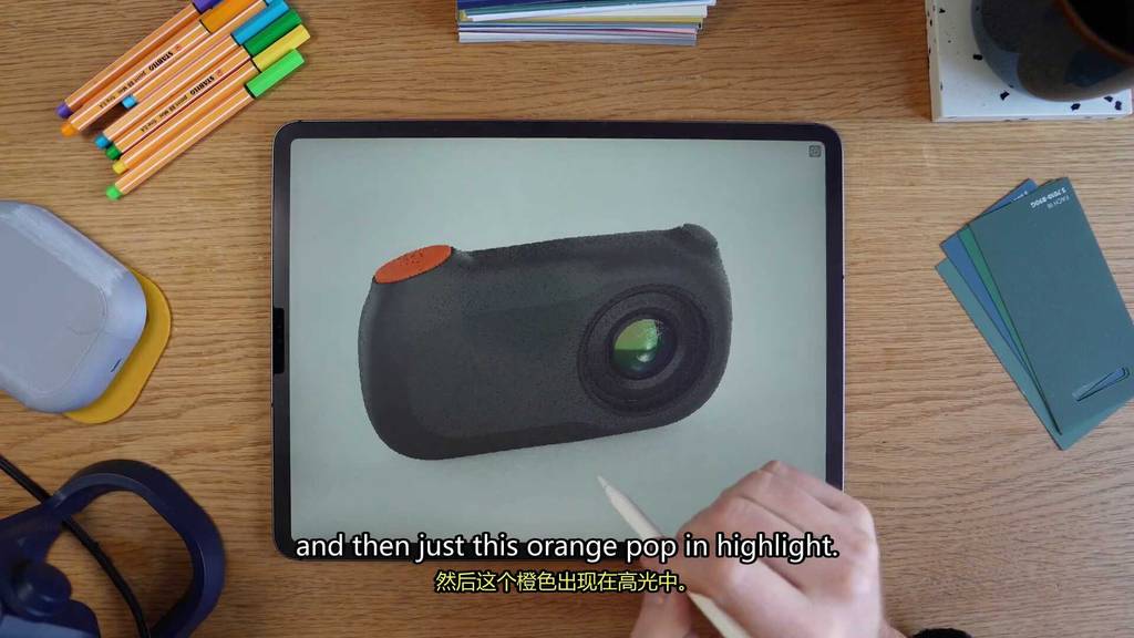
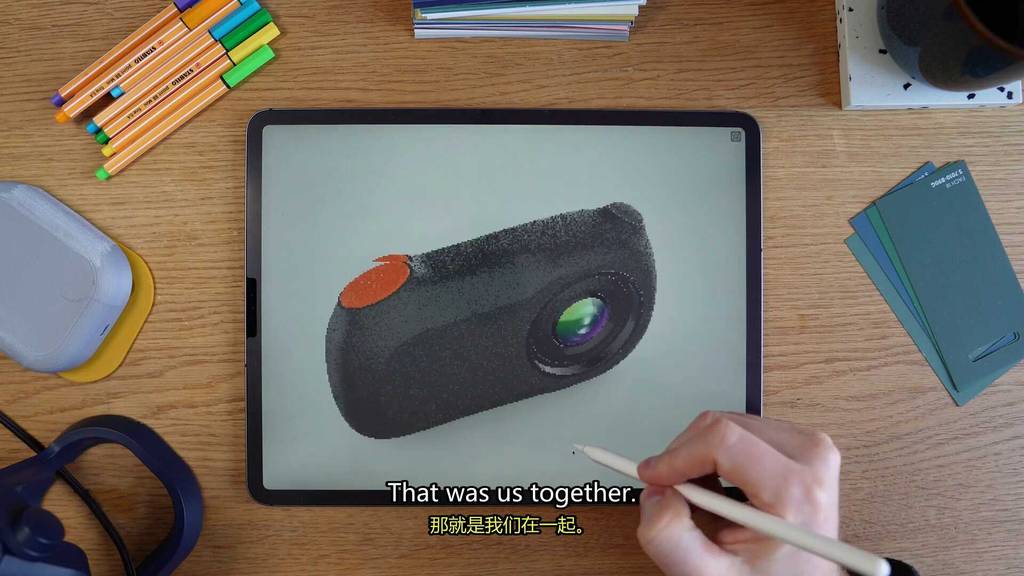
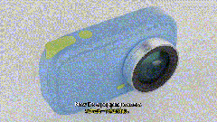
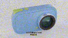
Okay, let’s see if we can make our alien camera pop with this cool color scheme.
Whoa, yeah, okay, that was it.
So we have this dark base texture.
It’s like a really dark gray and then just this orange pop in highlight.
It’s like a nice intense detail.
Kind of also works in this like alien-y theme we got going on this thing.
Hey, we did it.
That was us together.
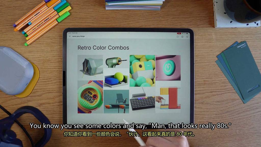
So moving to our second finish trend.
This one’s fun.
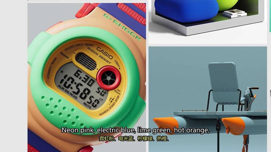
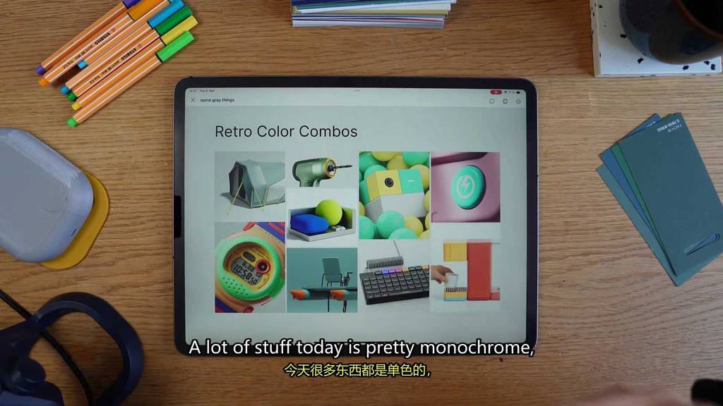
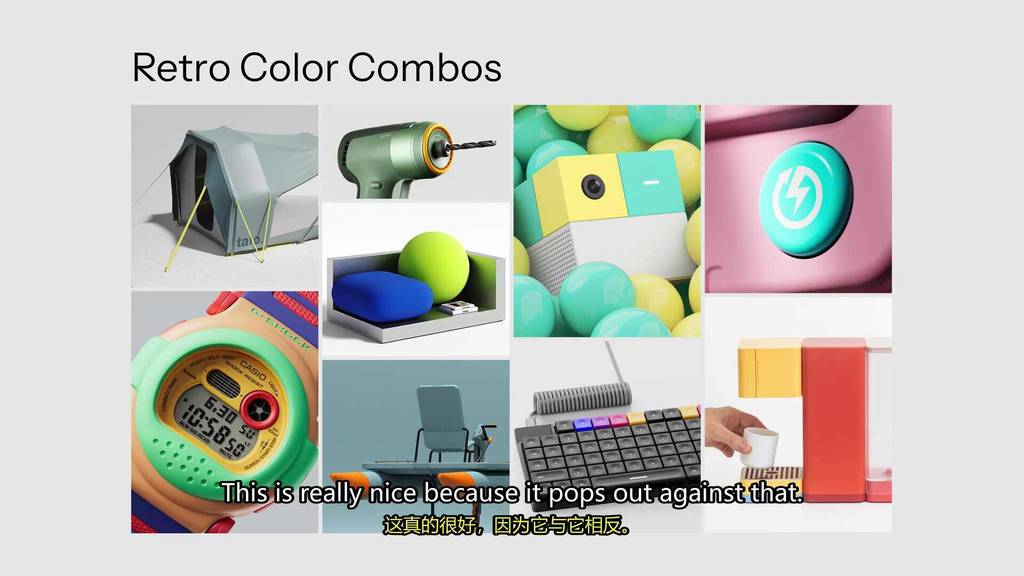
It’s the retro color combinations.
You know you see some colors and say, man, that looks really 80 s.
Well, all that stuff is back.
Neon pink, electric blue, lime green, hot orange.
All the crazy color schemes from the 80 s and 90 s, those are back.
The key about this color scheme is like a contrast between two really bold colors.
It adds a lot of personality to a product.
A lot of stuff today is pretty monochrome.
Like you know the whole millennial gray trend.
This is really nice because it pops out against that.
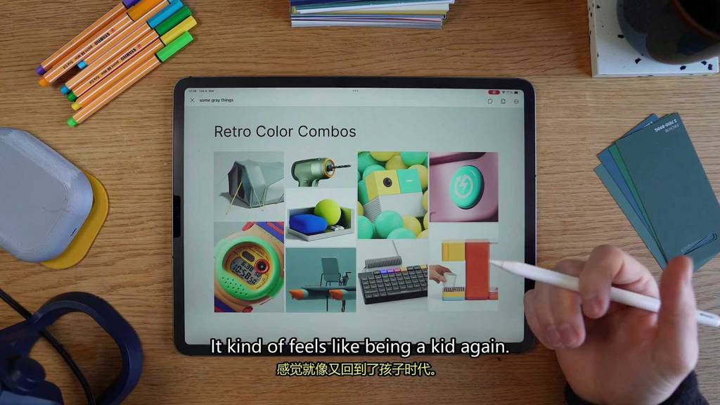
And also leans in this whole retro nostalgic feel.
Like it’s kind of, kind of feels like being a kid again.
I guess there’s also a lot of younger designers that have never really like grew up in the 90 s.
So maybe this is like an exciting new style.
It’s a little bit nostalgic, a little bit new.
Any whoozles?
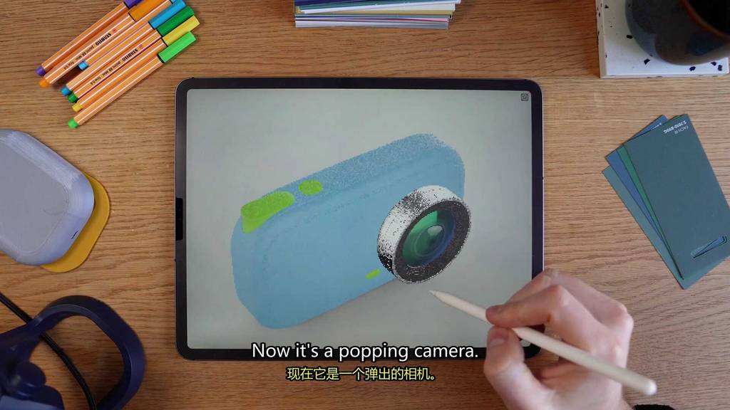
Let’s throw this on the camera, huh?
Yeah, okay.
That’s a, now it’s a popping camera.
I think we went from modern to retro pretty quick with that color scheme.
But it’s kind of cool.
Let’s try this.
Yeah, this is always so cool.
Maybe we do this.
I don’t know.
Let’s see what you think in the comments.
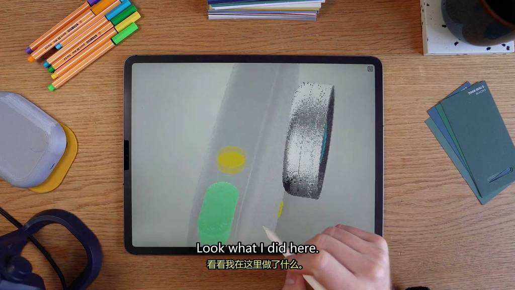
Look what I did here.
Say cheese.
Ha ha ha.
That’s what you say when you’re taking a picture.
This is going off the rails pretty quickly today.
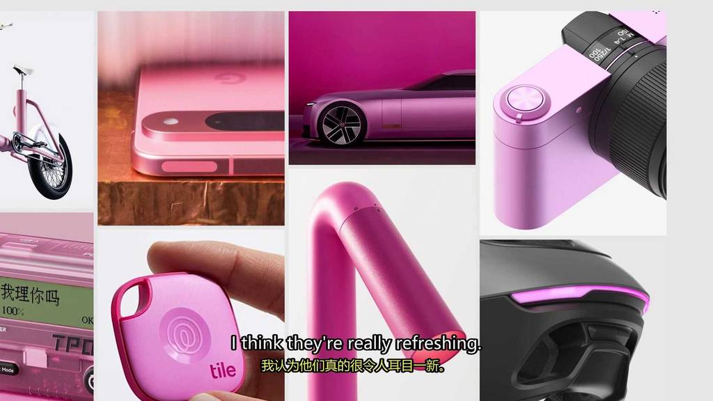
Hey, the color of the year.
I kind of didn’t want to do it, but you know it had to be pink.
Total transparency.
I almost picked this color last year.
But now the hype of the Barbie movie is over and it’s still here.
So yes, this year the color you’re waiting for was pink.
And it’s not just pastel pink.
It’s also hot pink, magenta, dark pink.
It’s different shades of pink.
I actually really like the pink designs.
I think they’re really refreshing.
I think a lot of designers stay away from pink.
But if you really just are bold and use it, you can really do some cool, nice, refreshing,
Modern designs.
What’s cool about it is depending on the shade you pick, you can either make stuff look soft
And inviting or really bold and intense.
It’s a good way to do something that’s different but doesn’t feel totally weird.
Let’s add this into one of our keywords.
I think that brutal camera would contrast really nicely with this.
Oh yeah.
Wow.
That’s intense.
It’s a pink brutal camera.
This is cool.
I’m really digging this actually.
There’s something really nice about this really intense bold structure with these really heavy
Lines and then this soft pink color.
All right.
So we have three cameras with the trends.
We have alien xenomorph camera with the flowing surface breaks and the evil teenage angel
In color scheme.
We have the half soft camera with our perimeter text details and a little bit of a retro color
Combo.
And we have our brutalist camera with some heavy line textures in a fabulous pink color.
Back to you in the studio, Gray.
So that’s the trends.
Thanks for watching.
I hope you enjoyed it and I hope you found some weird stuff.
Hope to see you in the next one and stay weird, product designers.
Later, skater.
Bye.
Bye.
Bye.
Bye.
Bye.
Bye.
Bye.
Bye.
Bye.
Bye.
T Yu.
.
Tä dem.
[处理出错: local variable ‘frame_path’ referenced before assignment]
App discourses bäile shej werder muелен &
[处理出错: local variable ‘frame_path’ referenced before assignment]
Oben sovereignlich,
[处理出错: local variable ‘frame_path’ referenced before assignment]
Topo Dir pray terg Traiesta장 parasite signa.
[处理出错: local variable ‘frame_path’ referenced before assignment]
Circumstance seu.